Tea of a Kind
Tags
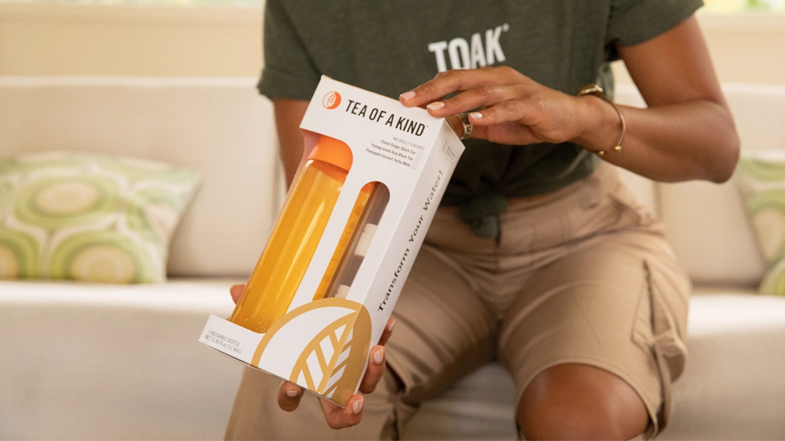
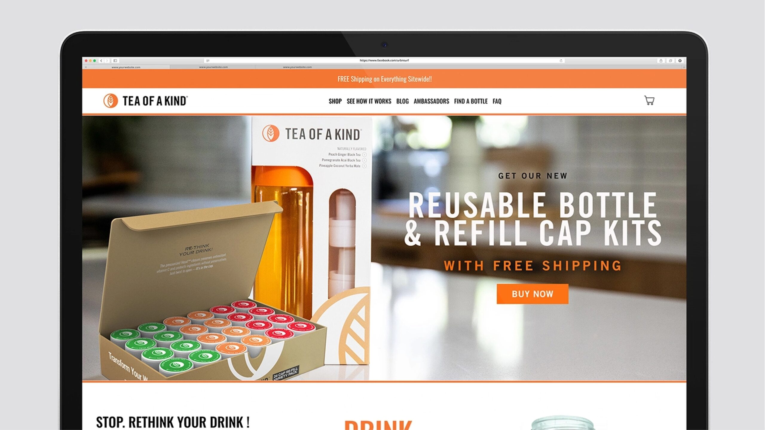
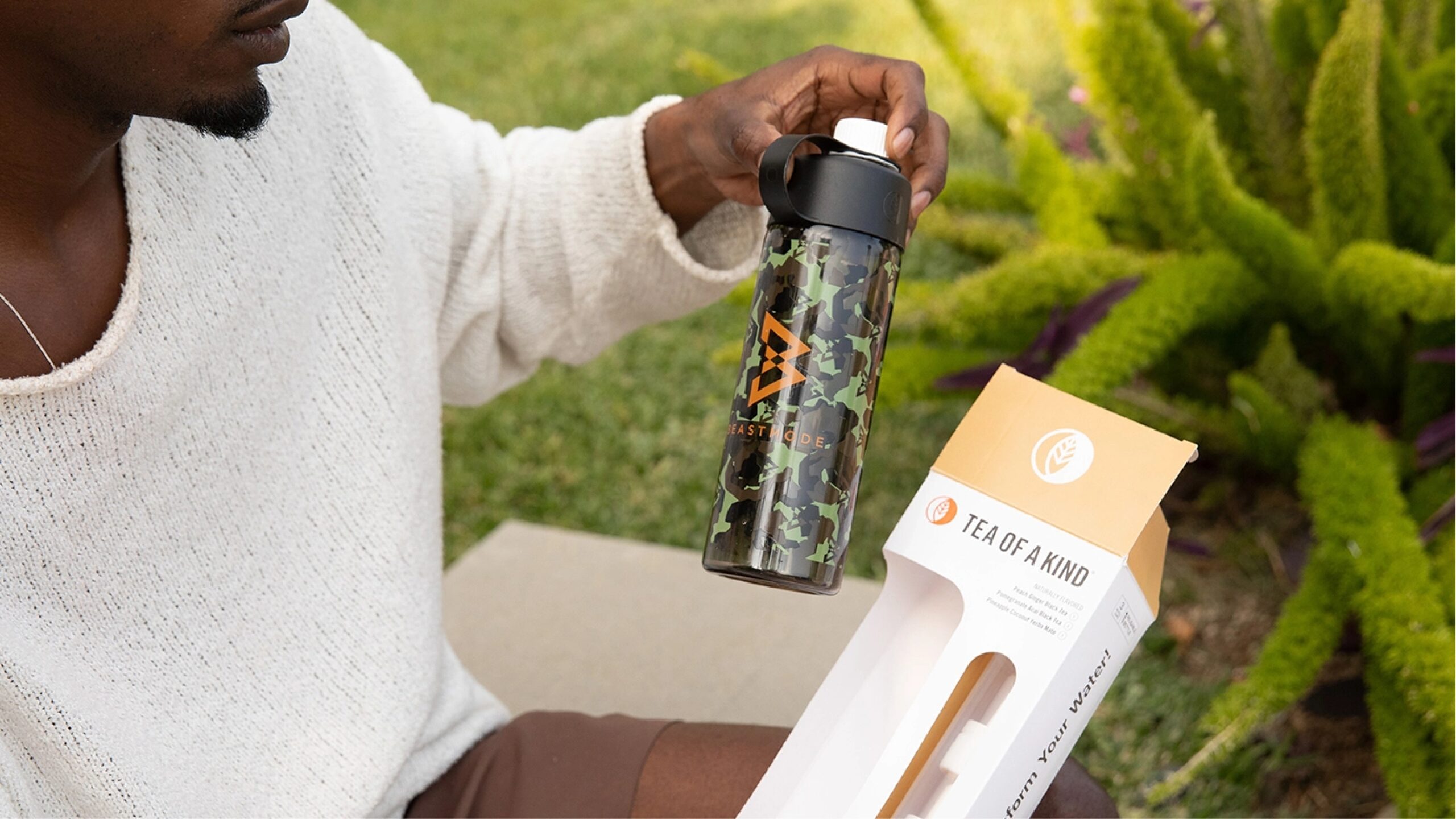
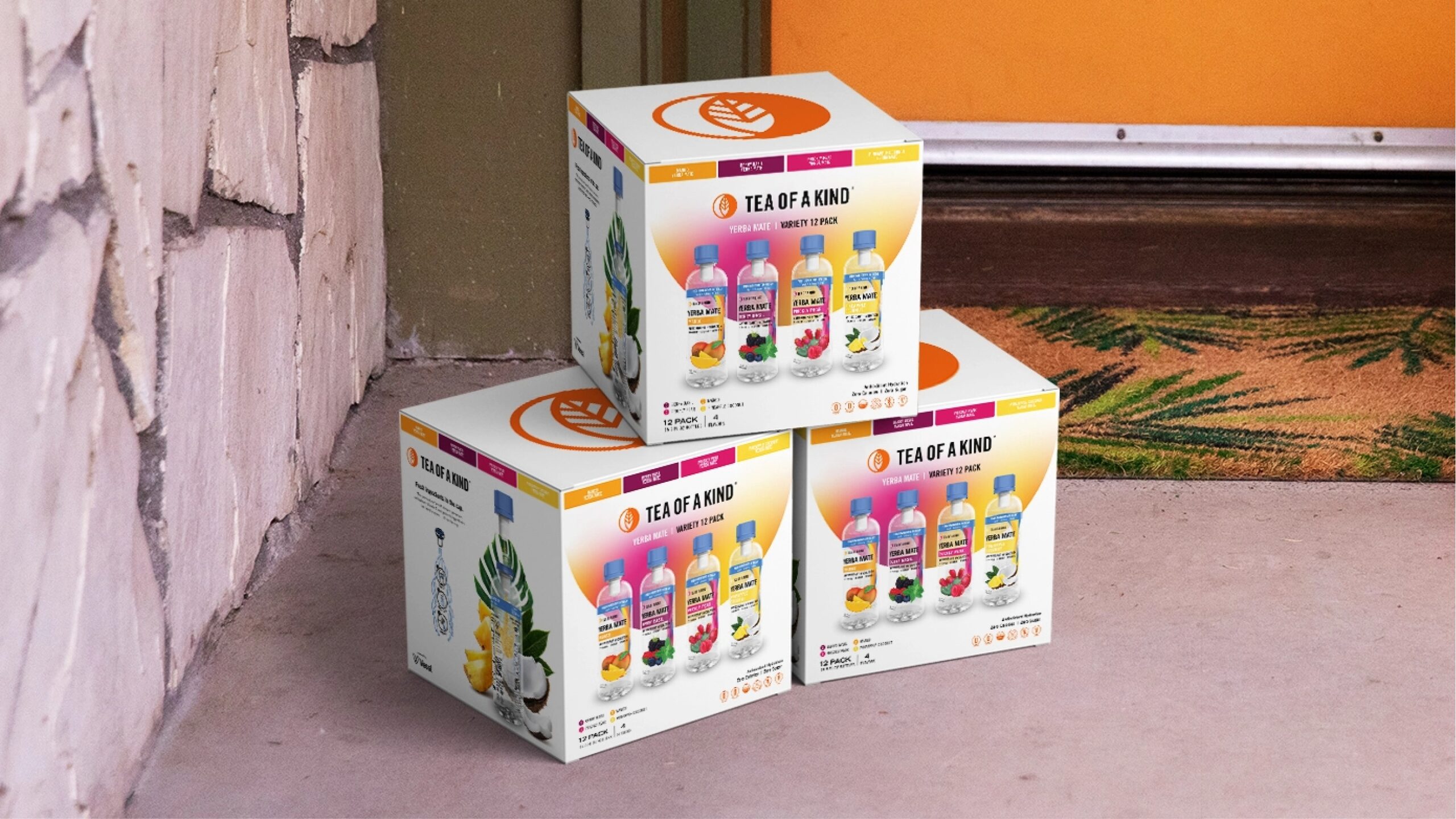
A Libre client for nearly a decade, we have been an instrumental part of their brand identity along with every brand and bottle refresh. The brand has received 3 major bottle overhauls all created by our in-house illustrators and designers. We’ve now introduced TOAK’s latest creation, the reusable bottle and refill packs.
Branding & Design
The Challenge
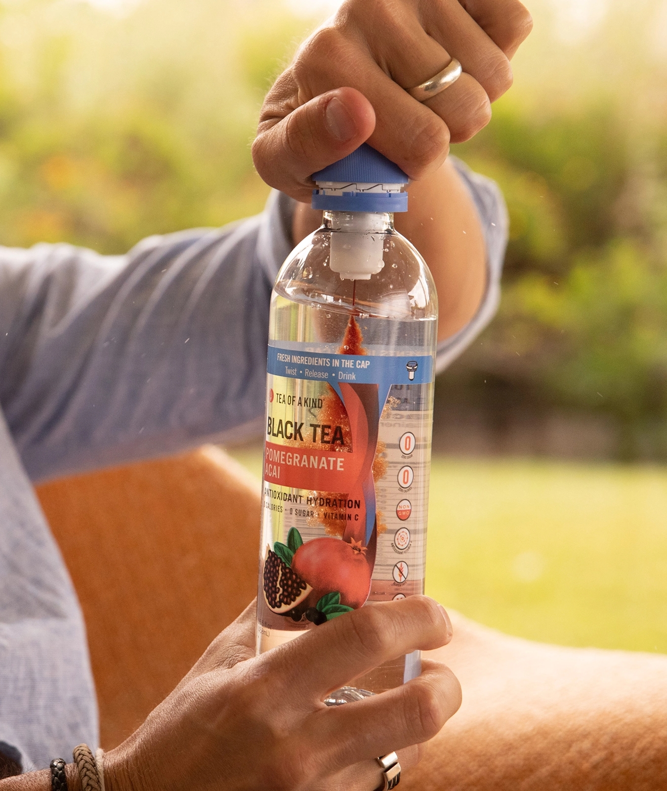
Leveraging years of data collection our goal was to create a design with the client that addressed their existing 70% female online audience while also appealing to all demographics. Additionally, we needed to create a bottle that showcased their proprietary technology the “Vessl cap” and how it activated the tea.
The Result
The Result
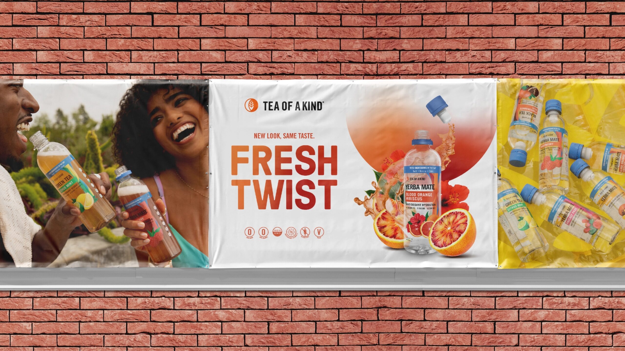
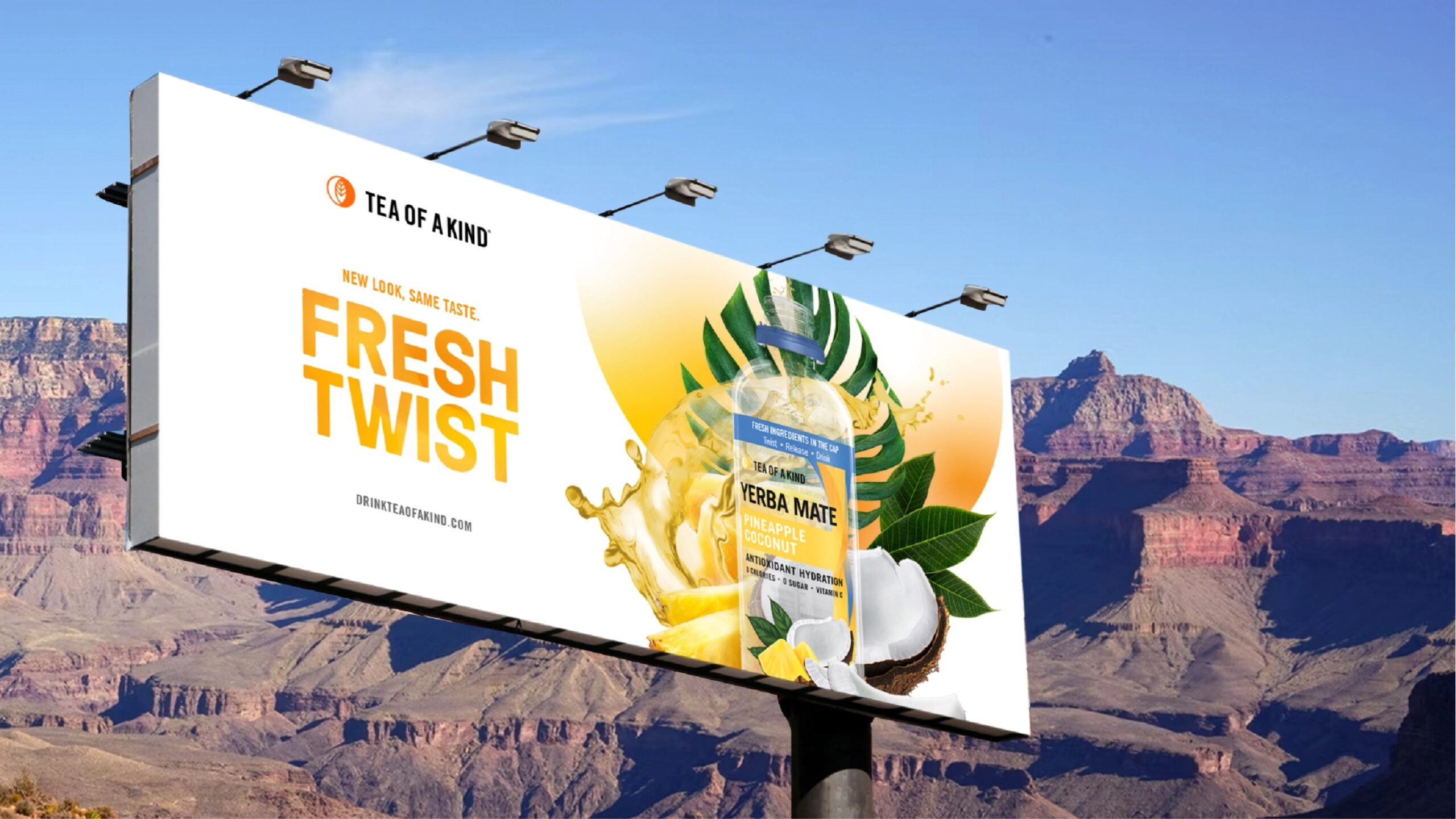
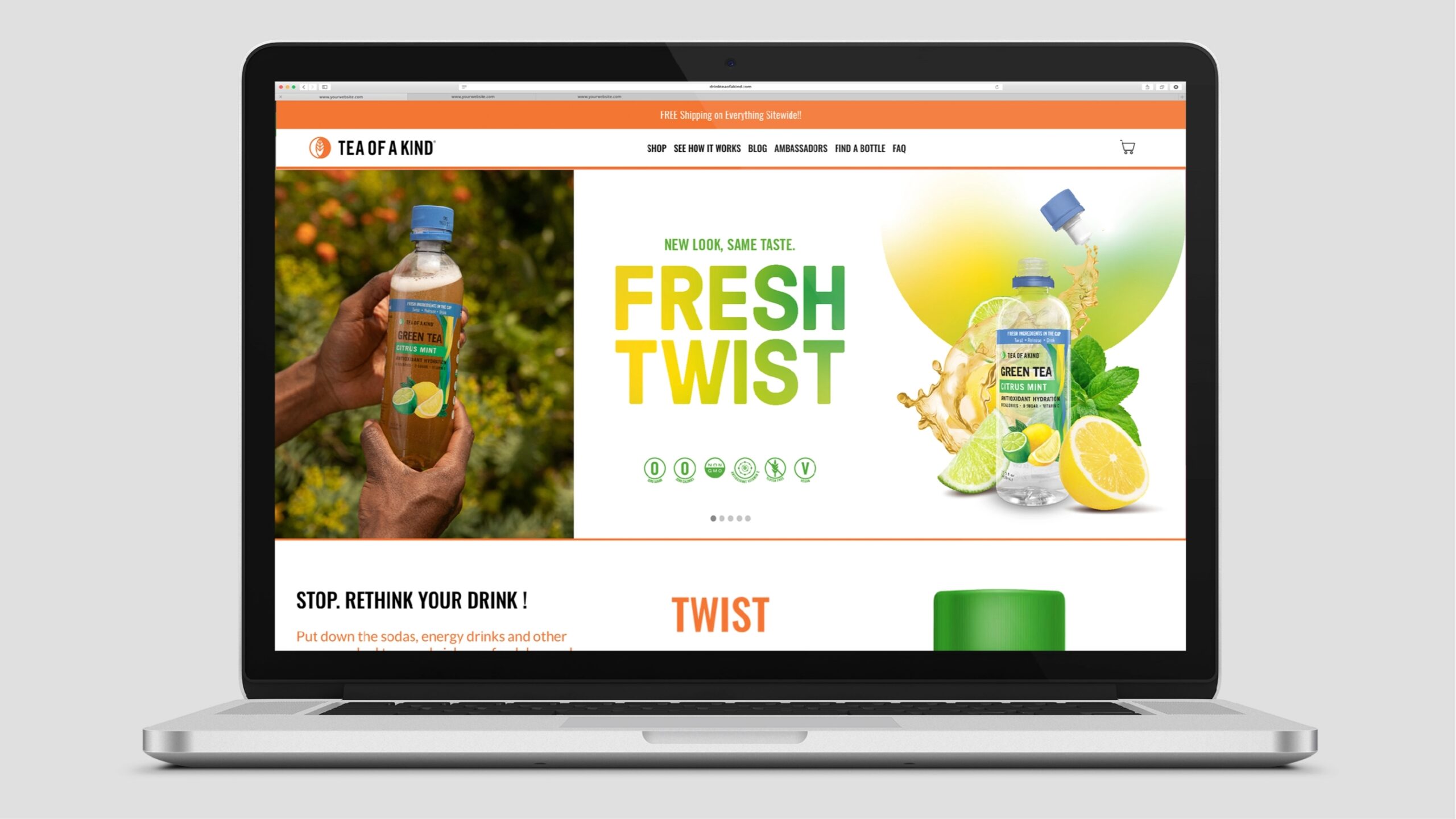
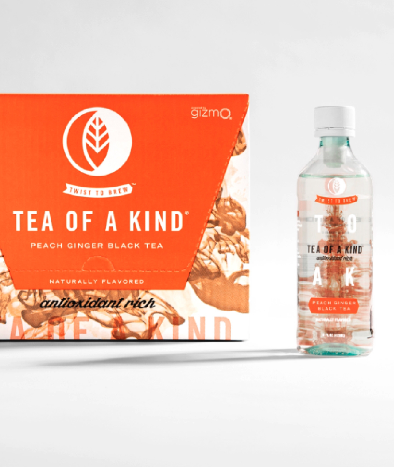
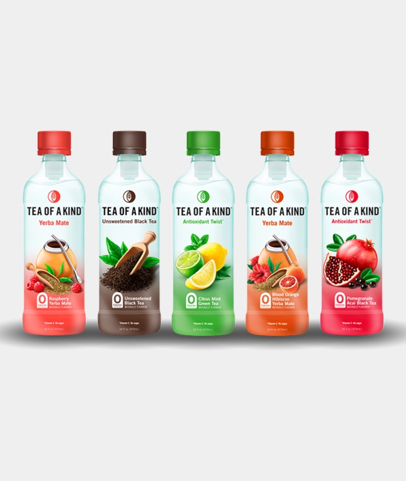
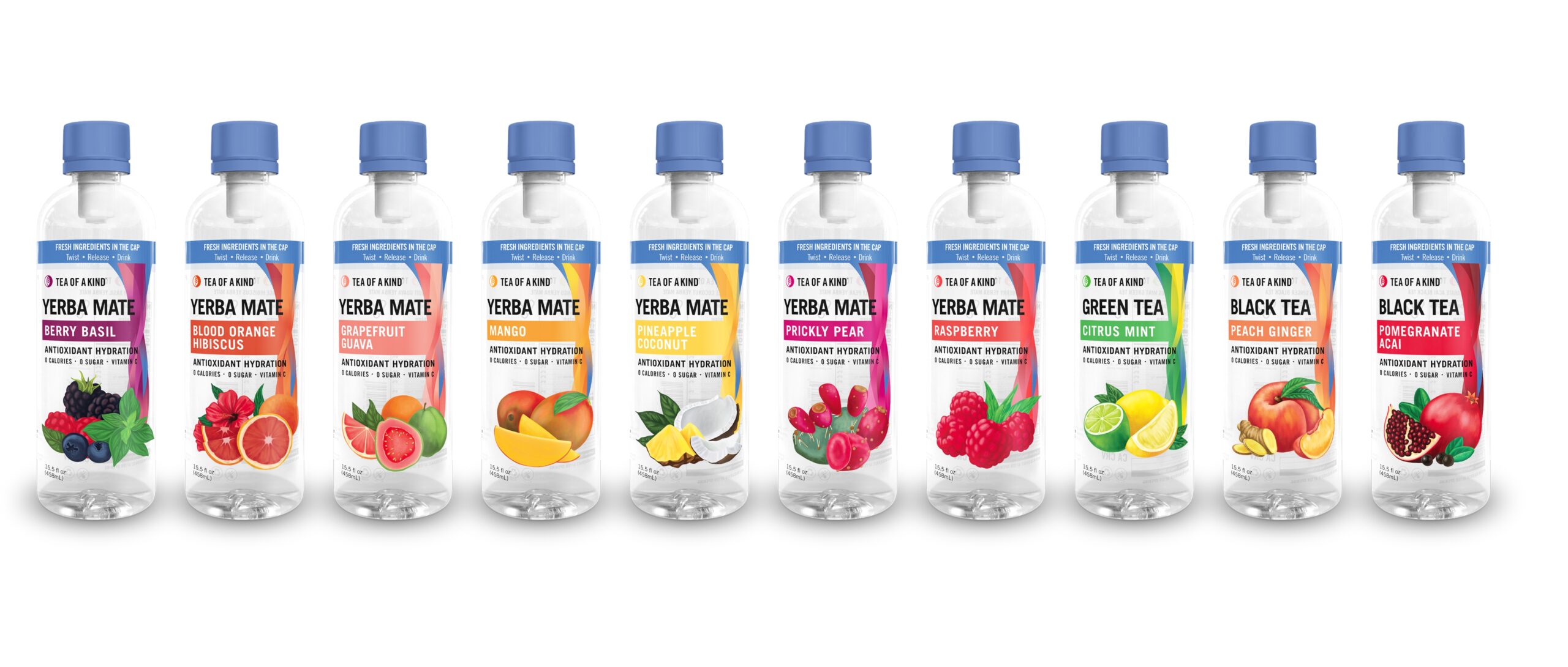
We worked with an illustrator to create custom illustrations for each tea flavor and moved away from the original bold color blocking to a softer gradient. In addition to illustrations and gradients, we also addressed flavor colors to give each flavor more pop and adjusted the Tea Of A Kind wordmark to be better optimized for confined spaces.
To support this new look we also created a campaign to launch the new look. We came up with “It’s in the cap.” to capture the essence of Tea Of A Kind’s unique point of difference (having the ingredients stored in the cap and released upon activation). The tag-line was supported visually with custom liquid flavor explosions that we created in-house.



Digital Marketing
Libre ran paid social ads for Tea of a Kind on Facebook & Instagram from 2021 – 2022. Tea of a Kind was primarily focused on growing their revenue and online conversions. During this one year period, Libre achieved:

Social Campaigns
0
ROAS

Social Campaigns
0
Revenue Growth
0
Clicks
0
Conversion Rate


